Most podiatry patients don’t consciously analyse websites.
They feel them.
Within seconds, their brain decides whether a clinic seems competent, safe, and worth contacting — long before they read treatment details or credentials.
Those first impressions matter more than most clinics realise.
Patients Arrive With a Problem, Not Curiosity
People visit a podiatry website because something hurts.
They’re not browsing for interest.
They’re looking for reassurance.
Pain shortens attention spans and lowers tolerance for friction.
If a site feels confusing or overwhelming, patients leave.
Patients Scan Before They Read
Before reading any text, patients notice:
-
Layout
-
Spacing
-
Order
If information feels scattered, confidence drops immediately.
Clean structure signals professionalism without saying a word.
Clear Headings Reduce Anxiety
Headings aren’t just navigation tools.
They help patients answer silent questions:
-
“Am I in the right place?”
-
“Do they treat my issue?”
-
“What should I do next?”
When headings feel clear and logical, anxiety decreases.
Patients Look for Familiar Language
Medical jargon creates distance.
Patients trust clinics that explain:
-
Conditions in plain language
-
Treatments simply
-
Outcomes realistically
Familiar words feel human.
Human feels approachable.
Visual Calm Matters More Than Design Style
Patients don’t care about trendy design.
They care about calm.
Overly busy pages increase stress.
Simple layouts help patients feel:
-
Oriented
-
In control
-
Less overwhelmed
Calm environments feel safer.
Patients Notice Whether Information Is Easy to Find
They may not realise it consciously.
But they feel frustration when:
-
Contact details are buried
-
Booking options are unclear
-
Key information is missing
Ease creates confidence.
Difficulty creates doubt.
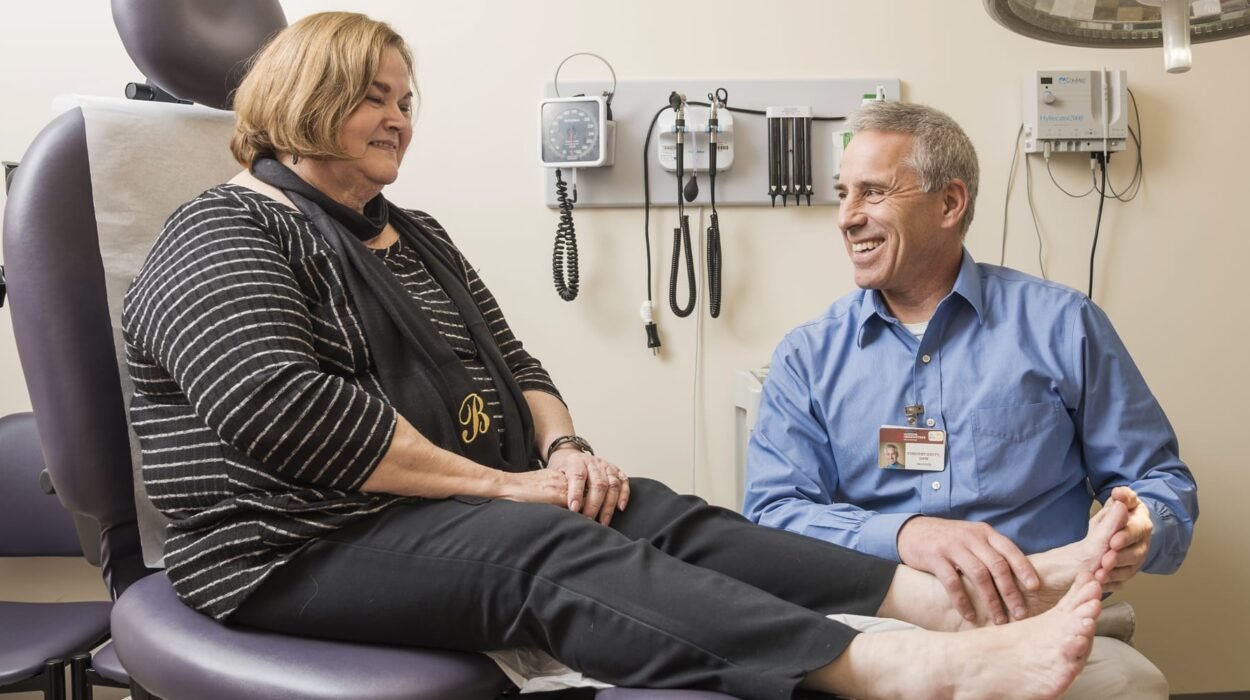
Images Influence Trust Instantly
Patients glance at images before reading text.
They notice:
-
Clean environments
-
Professional presentation
-
Authentic visuals
Poor or generic images weaken credibility — even if the care is excellent.
Patients Want Confirmation, Not Persuasion
They’re not looking to be sold to.
They want confirmation that:
-
Their problem is common
-
The clinic handles it routinely
-
They’ll be looked after
Sales language feels out of place in healthcare.
Consistency Signals Competence
Patients notice when pages:
-
Look different from each other
-
Use inconsistent language
-
Change tone abruptly
Consistency suggests a well-run practice.
Inconsistency suggests chaos.
Patients Look for Subtle Authority Signals
Authority doesn’t come from bragging.
It comes from:
-
Clear explanations
-
Confident tone
-
Absence of exaggeration
Quiet authority feels reassuring.
Booking Should Feel Obvious
Patients don’t want to search for how to book.
They expect:
-
Clear calls to action
-
Simple booking paths
-
Minimal steps
When booking feels obvious, action follows naturally.
Patients Notice What’s Missing
Missing information creates uncertainty.
Patients wonder:
-
“Do I need a referral?”
-
“Is this private or insurance-based?”
-
“What happens after I book?”
Unanswered questions delay decisions.
Tone Matters More Than Length
Long pages aren’t a problem.
Unclear tone is.
Patients respond to tone that feels:
-
Calm
-
Professional
-
Reassuring
Tone communicates care more than word count.
Patients Sense When a Clinic Is Rushed
Rushed language creates pressure.
Pressure increases hesitation.
Patients gravitate toward clinics that feel:
-
Attentive
-
Considered
-
Patient-focused
Even through a screen.
Navigation Shapes Confidence
Patients trust clinics where navigation:
-
Feels predictable
-
Works smoothly
-
Doesn’t surprise them
Predictability reduces mental load.
Reduced mental load increases trust.
Patients Avoid Clinics That Feel Impersonal
Overly corporate language feels distant.
Patients want to feel:
-
Acknowledged
-
Understood
-
Welcome
Warm professionalism beats cold efficiency.
Small Frustrations Accumulate Quickly
One small annoyance may be tolerated.
Several create resistance.
Resistance stops bookings.
Details matter more in healthcare than most industries.
Patients Don’t Want to Work Hard
If patients have to think too much, they disengage.
Ease is a competitive advantage.
The easier it feels, the more likely they are to book.
Websites Should Remove Doubt, Not Add It
Every page element should reduce uncertainty.
If it adds confusion, it works against you.
Clarity always wins.
Patients Decide With Emotion, Then Justify With Logic
They feel confident first.
They justify later.
Your website’s job is to create that confidence.
Comfort Is the Real Conversion Factor
Patients don’t choose the “best” clinic.
They choose the one that feels right.
Feeling right leads to action.
First Impressions Shape the Entire Journey
If the website feels calm and professional, patients expect the clinic to be the same.
Expectation influences satisfaction.
Satisfaction drives referrals.
Small Improvements Have Outsized Impact
Minor changes in:
-
Layout
-
Language
-
Flow
Can significantly increase bookings.
Because they affect how patients feel.
Final Thought (And a Quiet Invitation)
If patients visit your podiatry website but don’t take the next step, the issue may not be your services.
It may be how the site feels.
Small improvements in clarity, calmness, and ease can dramatically increase appointment bookings.
If you’re looking for podiatry SEO that understands patient behaviour, decision-making, and real-world booking psychology — not just rankings — you’re welcome to get in touch.